
Capturing Responsive Design
High Fidelity Web Archiving for Multi-Source Images
Have you ever visited the same web page using a bunch of different devices and commented to yourself about how crisp the images look regardless of the browser, screen size, and resolution used to view the page? Likewise, have you ever encountered that when capturing such a nice web page with your favorite web archiving tool and attempting to access said page right after, exactly these images appear to be missing?
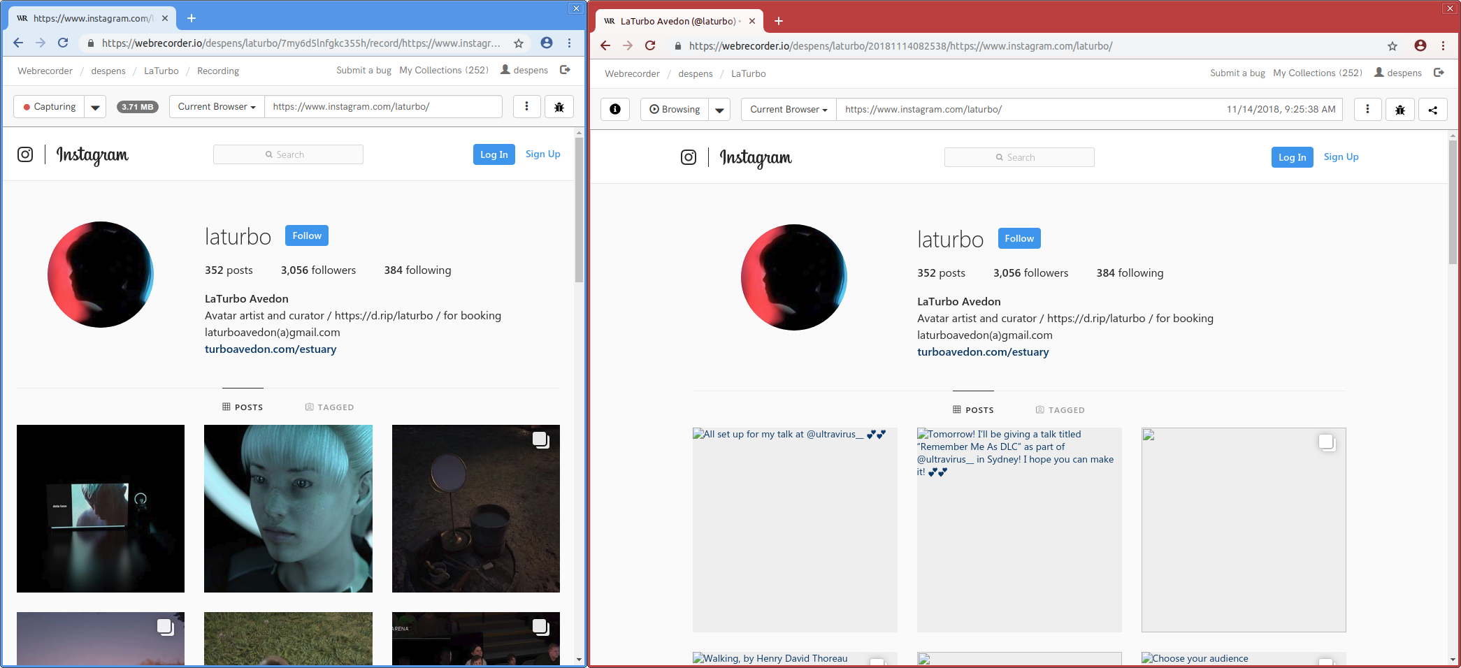
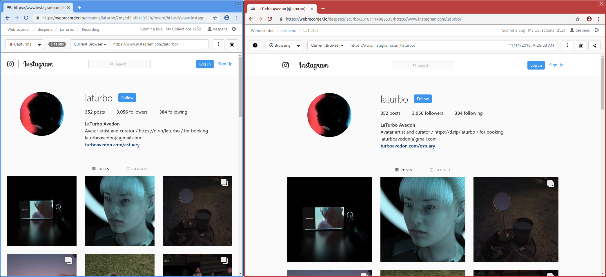
That’s what happened to the Webrecorder team when we noticed that images clearly being displayed during the capturing session (blue browser skin) were missing when accessing the web archive (red browser skin) for the Instagram page of artist LaTurbo Avedon.
As you can imagine this was disconcerting and left us wondering what went wrong during capture and or access, as well as, how we could handle Instagram’s main content — images — better.
The issue became apperent when we performed a post-mortem on the captured page and discovered that Instagram is using a common web design pattern known as responsive design. More specifically, an instagram image is not defined by a single file loaded from a single URL. Instead there is a set of URLs, and the browser is instructed to pick the most fitting one for the currently available screen size, pixel density, and browser window width. This helps pages to load faster, as only the image pixels that can actually be seen later will be requested by the browser.
An example image tag (formated for presentation) from Instagram is shown below:
<img decoding="auto" sizes="293px" srcset="
https://scontent-atl3-1.cdninstagram.com/vp/.../s150x150/..._n.jpg 150w,
https://scontent-atl3-1.cdninstagram.com/vp/.../s240x240/..._n.jpg 240w,
https://scontent-atl3-1.cdninstagram.com/vp/.../s320x320/..._n.jpg 320w,
https://scontent-atl3-1.cdninstagram.com/vp/.../s480x480/..._n.jpg 480w,
https://scontent-atl3-1.cdninstagram.com/vp/.../s640x640/..._n.jpg 640w"
src="https://scontent-atl3-1.cdninstagram.com/vp/.../s640x640/..._n.jpg">
Because a smaller window size was used during the capturing session, the browser requested a certain low resolution image, which was captured by Webrecorder. A larger window size was used during access, the browser requested another image file with a slightly higher resolution. Since this exact version of the image wasn’t captured before, it appears as missing.
As visible in the example above, the srcset attribute of the image tag defines a set of images that the browser chooses to load based the amount of physical pixels the image will take up on screen. This is mostly dependent on the width of the viewport.
However there is one more browser capability to be considered, media queries.
Media queries are another way to conditionaly define resources that are to be displayed or styling to be applied to the page based on a visual condition, output device capability, and user preferences. Typically media queries can be found in style sheets (CSS).
Live web examples of media queries are shown below (formatted for presentation) from youtube.com, facebook.com, and cnn.com:
/* from youtube */
@media (-webkit-min-device-pixel-ratio: 2), (min-resolution:2dppx),(min-resolution:192dpi) {
    [crane-kick] .ytp-scrubber-container:before {
        background-image:url(https://www.gstatic.com/youtube/img/originals/ckee/crane-kick@2x.png);
    }
}

/* from facebook */
@media (-ms-high-contrast: black-on-white) {
    ._5lxt,._6qfu {
        background-image: url(/rsrc.php/v3/yf/r/dxigF_3tzG8.png);
    }
}

/* from cnn */
@media only screen and (max-width: 639px), only screen and (max-height: 505px) and (orientation: landscape) {
  #mvpdpicker .steps {
     background: url("//www.i.cdn.cnn.com/.a/2.118.0/assets/mvpd-picker/mobile_steps_1.png") center bottom / contain no-repeat; -webkit-box-flex: 0; flex: 0 0 auto;
  }
}
Youtube uses media queries to change the background image of the video scrubber based on minimum screen resolution and pixel density. Facebook defines a rule also changing a background image of an element if the screen is in high-contrast mode and CNN defines a rule setting the background of an element dependent on the maximum width of the screen and or whether the screen is in landscape orientation.
Another srcset attribute usage pattern of note is its usage on <source> tags within a <picture> tag in combination with lazy loading. An example of this is shown below.
<picture>
 <source media="(min-width: 64em)" sizes="250w"  data-srcset="....">
 <source media="(min-width: 48em)" sizes="230w"  data-srcset="....">
 <source media="(min-width: 0px)"  sizes="100w"  data-srcset="....">
 <img data-src="....">
</picture>
The <picture> tag may include zero or more <source> tags and a single img tag where each source tag represents a single value of a standalone img tag’s srcset attribute.
When the picture tag shown in the example above is loaded, the browser will evaluate the media conditions of each source tag and choose the URL contained in the srcset attribute of the matching source tag to be displayed.
If none of the source tags media conditions match the current display/device then the src attribute of the img tag is choosen to be displayed.
We know the picture tag shown in the example above is apart of a lazy loading scheme because the srcset and src attributes are not defined on their respective tags but included as data attributes.
This is typically done to improve page load times by setting the real srcset and src attributes using JavaScript only when it is determined (by the pages JavaScript) that it is time to show the image to the viewer.
From this we know that Webrecorder must not only be able to preserve the set of URLs contained in the srcset attribute of the <img> tag and <source> tags that are children of the <picture> tag, every URL found in media query based style definitions, but also the values for the data-srcset and data-src attributes of <img> and <source> tags when they are children of the <picture> tag.
Introducing The Responsive Capturing System
The Responsive Capturing System is a client-side solution that runs in the background, via a web worker, while users capture a page. The system operates by injecting a custom web worker script in both traditional url rewriting mode as well in proxy mode.
This allows Webrecorder to discover and fetch resources found in srcset and @media rules that are not requested by the browser but may be needed for future access, in a manner that does not degredate capturing performance.
Additionally, this is not a Webrecorder-only feature, but is built right into its web archiving core component pywb as a part of the 2.1 release! It features many more capturing and access improvements.
To find out how you can use the Responsive Capturing System in pywb today please consult its documentation.
We are excited to announce that the solution to this issue has been deployed on Webrecorder.io, both when using native and remote browsers!
Feedback
If you have any questions or comments about the Responsive Capturing System, don’t hesitate to comment here, on github, or by writing to us at support [at] webrecorder.io.